
I’ve been thinking about covers for a while now. One of the many great debates around the ephemeralisation of music has been the lamentations for the loss of cover art: now, we are reaching the same point with books.
I say ephemeralisation rather than digitisation because it’s not just a physical transformation we’re going through, it’s a cognitive one. I’ve been repeating Walter Pater’s famous quote in my head a lot: “all art aspires to the condition of music”. Pater argued that “For while in all other works of art it is possible to distinguish the matter from the form, and the understanding can always make this distinction, yet it is the constant effort of art to obliterate it.” One way of seeing this ‘condition’ of music is that it is abstract, it is all around us, it is ever-present and always available, but intangible. Literature, cloud-based or electronically present, accessible on this or that device, encountered in differing forms and extractions, quoted and misquoted, has been separated from the physical book, with all the dissonance this implies.
Anyway. Covers.
“Don’t judge a book by its cover” has never been more true. This is not good:

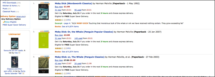
But this is the way most of us see covers now: as blurred little icons; nothing like the designer / art director / marketing dept. envisaged, and no use for their intended purpose.
This particularly sprung to mind this week with the arrival of Andrew Wylie’s Odyssey Editions, an ebook-only classics imprint designed and built by my old employer Enhanced Editions. The covers are, of course, beautiful:
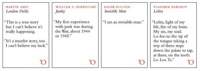
The covers are typographic, and hark back in particular to the famous Pelican cover for John Berger’s Ways of Seeing, where the text starts on the front cover. But it struck me that they are not covers in any traditional sense: they have nothing to cover. They are icons. Signifiers. And more crucially, they’re not there to sell the book directly; they are marketing material separated from the point-of-sale.
Cover art only sells physical books. In an ideal world we would get rid of cover art altogether. This is probably what JD Salinger desired, in his refusal to countenance any imagery at all on his book covers (a request that continues to be honoured, notably in Hamish Hamilton and Seb Lester’s beautiful new editions).
If we’re going to continue to use “covers” as marketing material, which presumably we will as long as digital texts have physical counterparts, we need to recognise that their reproduction is out of our control: they will be copied, linked, and reposted, at different resolutions and sizes (there’s long been a muttering desire from publishers for the ability to supply Amazon with different covers for different size displays: this is one option, but not one Amazon seems happy with). We might also recognise that there are potentially many different jobs for the cover to do.
What do covers do now? They appeal aesthetically (something hard to do at 120 pixels high). They give space to blurbs and plaudits (it’s OK, we’re not space-limited any more). And they recommend (this is why all thriller covers look the same; why there is a blood-spattered crime vernacular; why every historical novel features a bodice and ruched velvet).
Text-based covers are one approach. Alongside Odyssey’s, I’ve long been a fan of Melville House’s novella series, and Reclam‘s uncompromising non-fiction:
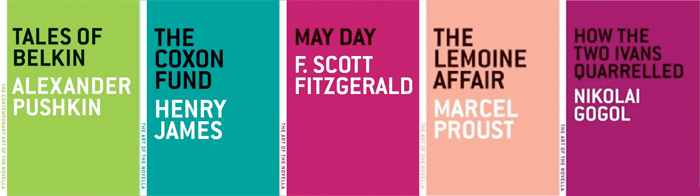
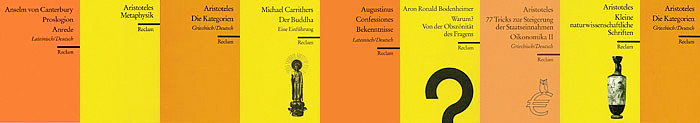
This is recommendation through publisher branding: possibly the strongest icon-based approached.
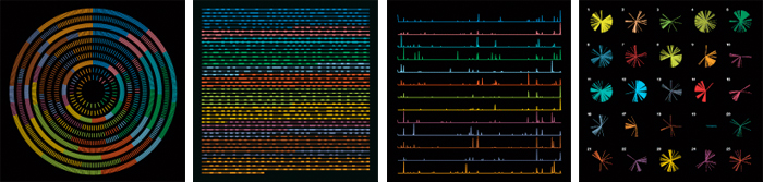
But could we represent this recommendation somehow? Is there a better way? I’m not sure, but I like, for example, Stefanie Posavec‘s “representations” of OK Go’s album “Of the Blue Colour of the Sky”, which formed that record’s cover art:
I know I’ve been talking a lot about visualisation lately, and perhaps it’s a passing thing. But it feels like we’re missing an opportunity here, before book jackets go the way of album covers. To encode some of our knowledge of books in a way that’s both attractive and useful to readers. To remake the cover in the service of the digital book. Representation and recommendation are two possible approaches. What others are there?
 About James Bridle
James Bridle does things with books, mostly. With a background in both computing and traditional publishing, he attempts to bridge the gaps between technology and literature, whether that takes the form of writing about the publishing industry, consulting to leading international publishers, or actually being a publisher.
James created Bookkake, a small publisher using new technologies to bring new life to independent publishing, and Bkkeepr, an attention data service for bibliophiles. He writes about books and the publishing industry at booktwo.org and runs a series of websites including Quietube, an accidental anti-censorship proxy for the Middle East. In 2009 he helped launch Enhanced Editions, the first ereading application with integrated audiobooks.
(Note: this article originally appeared at booktwo.org)